Introduction: In a transformative endeavor, I undertook the complete rebranding of the Amethyst Bay Hotel. This project aimed to rejuvenate the hotel's image, drawing inspiration from its original identity by incorporating amethyst crystals into a new logo. By carefully selecting fonts and colors, the objective was to instill an extravagant atmosphere and position Amethyst Bay as a luxurious yet affordable destination, making luxury accessible to all.
Client Information: Amethyst Bay Hotel sought to reposition itself in the hospitality market by embracing a fresh identity. The goal was to become a standout player in the realm of luxury hotels that catered to a diverse clientele, providing affordable luxury experiences.
Project Overview: The rebranding project for Amethyst Bay Hotel encompassed a comprehensive makeover, from the logo to the color palette and marketing collateral. The primary objective was to elevate the brand's image to a luxurious and accessible level, appealing to a broader spectrum of travelers.
Font Selection: Fonts played a pivotal role in conveying extravagance. "Brand" and "Montserrat" were carefully chosen to add an element of sophistication to the brand's visual identity. These fonts exuded a sense of luxury that resonated with the desired brand image.
Color Palette: To evoke a sense of opulence and luxury, the color palette underwent a transformation. Deep and rich colors, thoughtfully selected to complement each other, were introduced. This new color scheme elevated the brand's visual identity, making it feel luxurious and inviting.
Design Process:
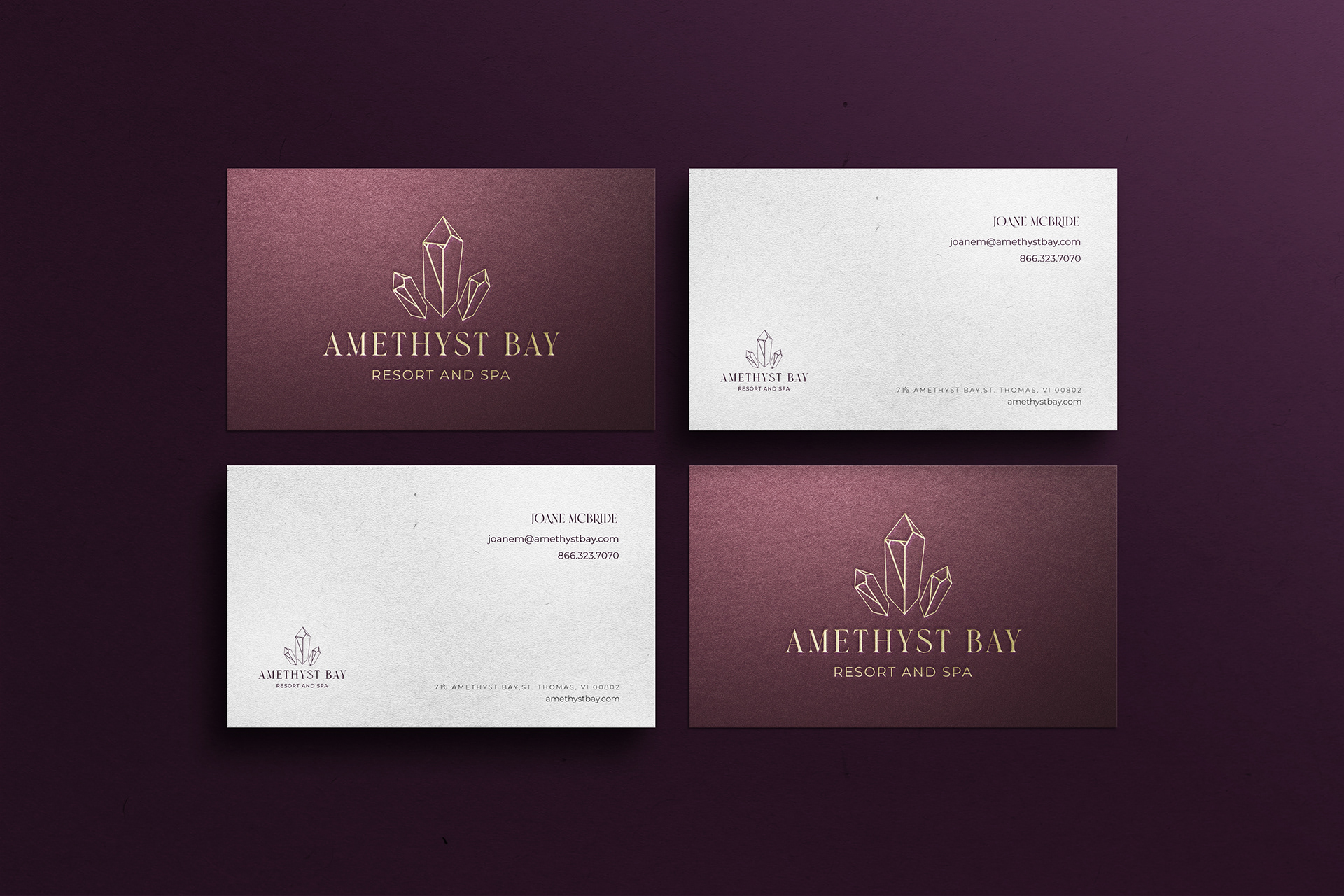
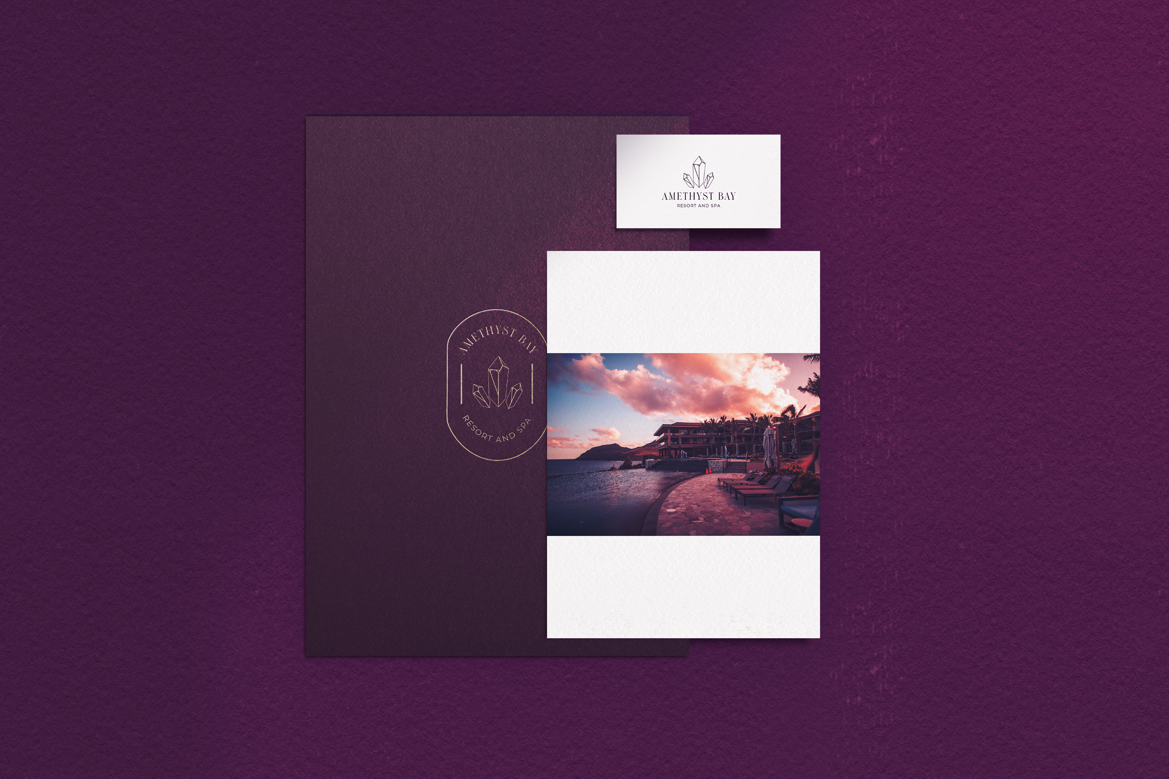
Logo Redesign: The heart of the rebranding was the creation of a new logo. Drawing inspiration from amethyst crystals, the new logo retained a connection to the hotel's original identity while infusing it with fresh sophistication. This logo served as the cornerstone of the rebranding effort.
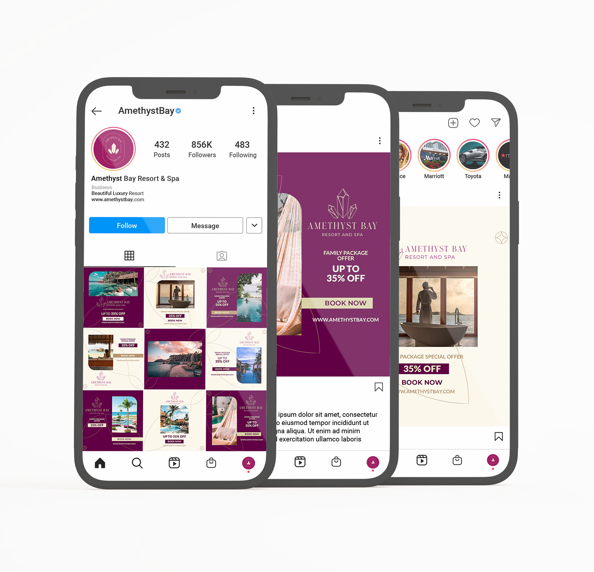
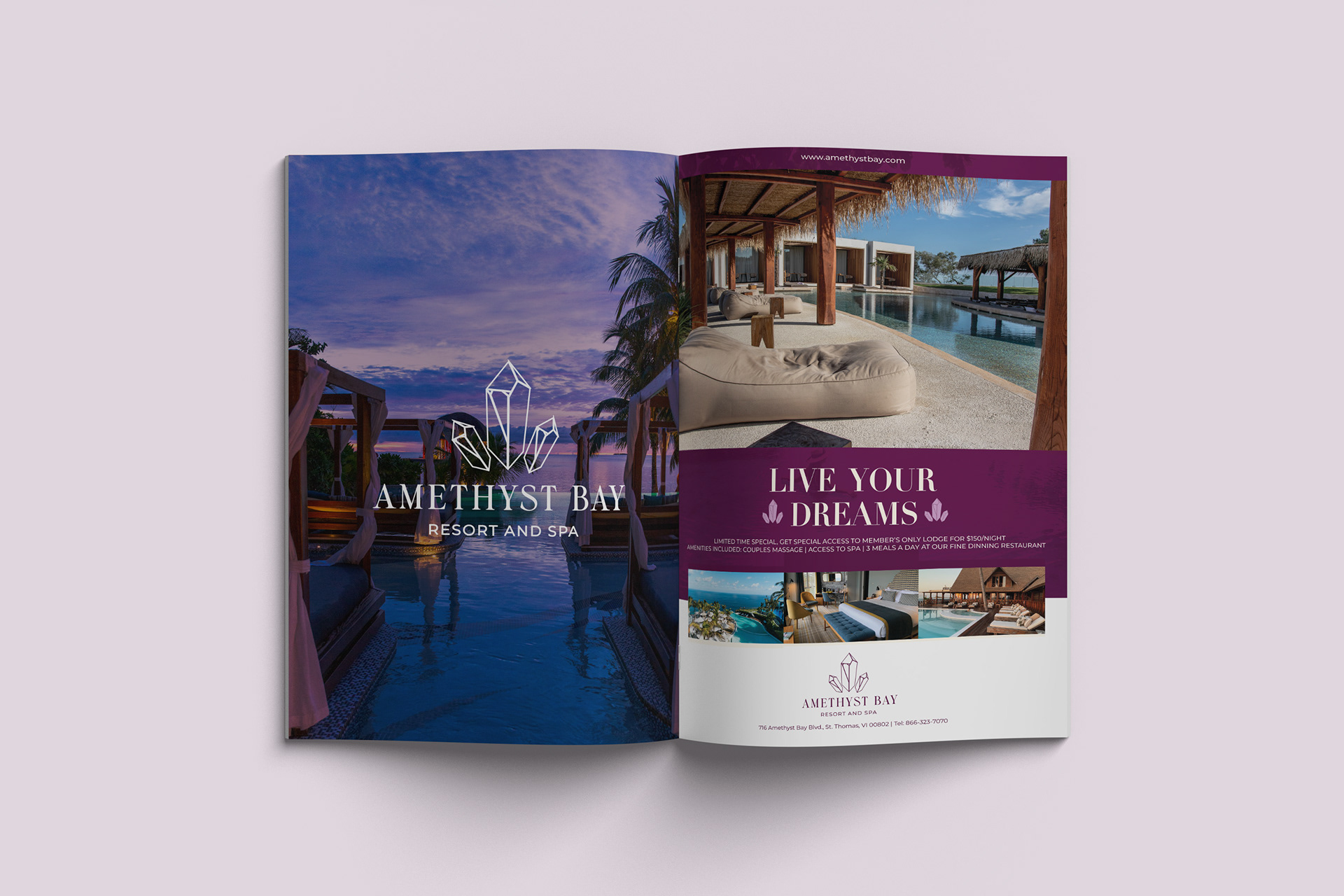
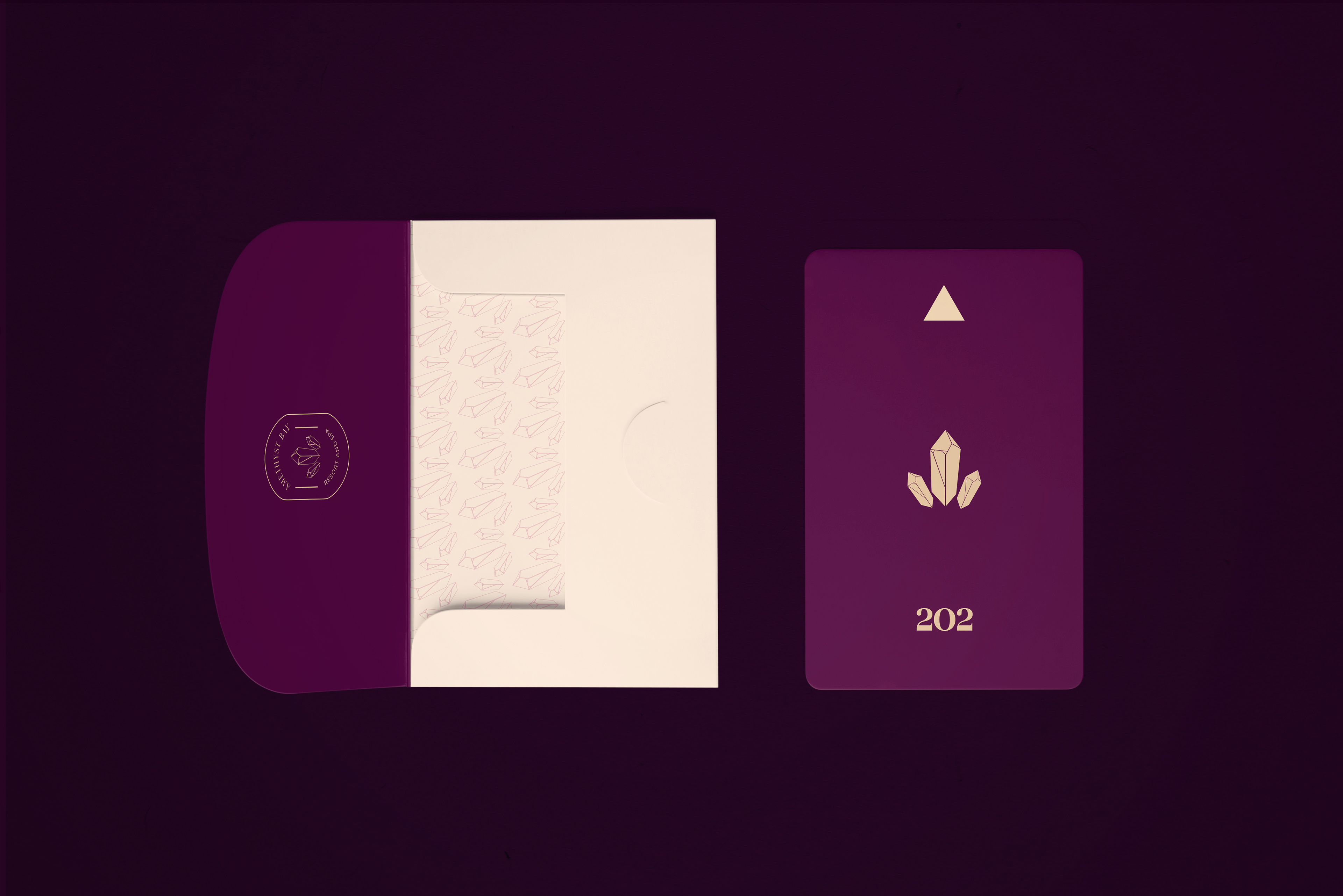
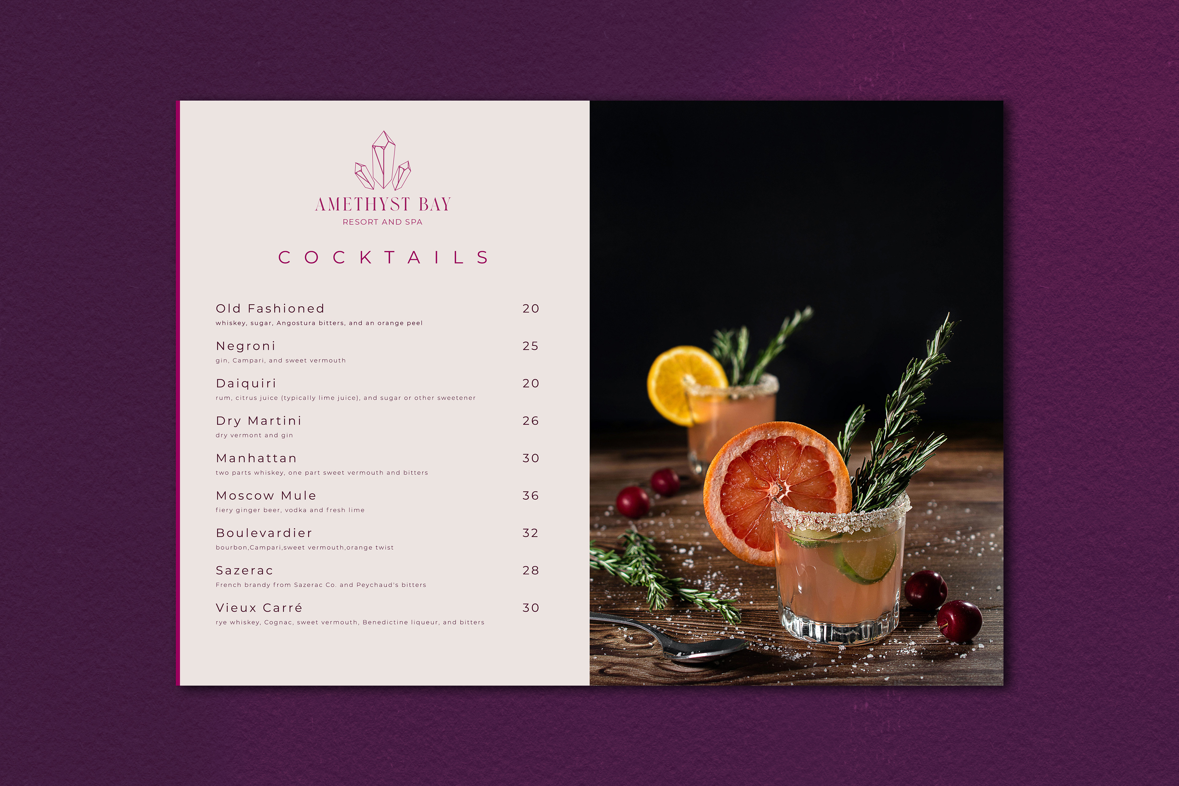
Additional Business Collateral: In addition to the logo redesign, I extended the brand's visual identity to various business collateral materials. This included designing key cards for guests, creating menus for the hotel's restaurant, developing advertising materials to promote the hotel, and crafting engaging social media content to connect with a wider audience.
Business Systems
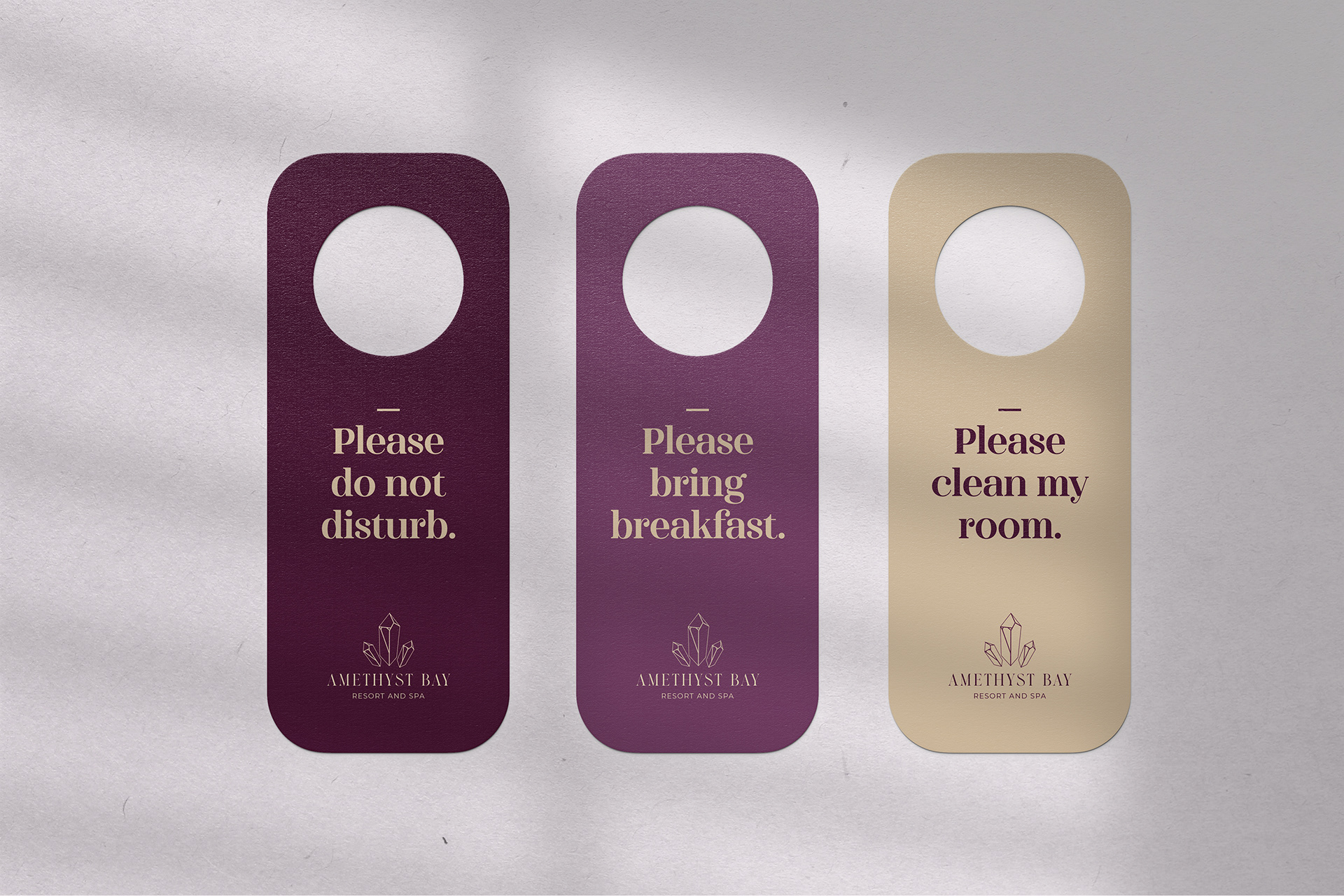
Hotel Key and Door Signs
Drink Menu
Challenges and Solutions: A significant challenge in this project was achieving a balance between luxury and affordability in the brand's image. To address this, I focused on creating an aura of luxury through design elements, fonts, and colors while ensuring that the brand remained approachable and welcoming to a wide range of guests.
Results: The Amethyst Bay Hotel's rebranding initiative has successfully positioned the brand as a luxurious yet affordable destination. The new logo, fonts, and color scheme have transformed the hotel's visual identity, making it a compelling choice for travelers seeking an opulent experience within their budget.
Conclusion: The Amethyst Bay Hotel rebranding project was a journey of rejuvenation and transformation. By infusing the brand with elements of luxury and sophistication, it now stands at the forefront of affordable luxury hotels, appealing to a diverse audience of travelers. To explore further design possibilities or learn more about our rebranding services, please feel free to contact me.
Advertising
